
# AI desk Pro Dashboard Guide
Welcome to the AI desk Pro Dashboard tutorial. In this guide, we'll walk you through the various components of the dashboard available at admin.aidesk-pro.com, helping you to monitor and analyze your usage effectively.
# Accessing the Dashboard
To access the dashboard, navigate to admin.aidesk-pro.com (opens new window) and log in with your credentials. Upon successful login, you will be presented with the dashboard overview.
# Dashboard Overview
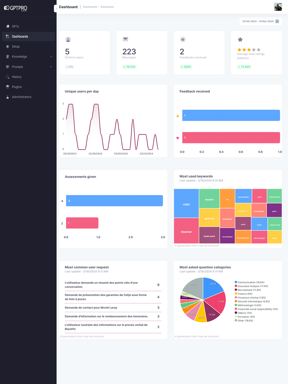
The AI desk Pro Dashboard is designed to give you a quick snapshot of key metrics and activities associated with your AI desk Pro instance. Here's what you'll find:
# 1. Number of Users
# Definition
Number of distinct users who interacted with the bot at least once during the selected period.
# Calculation method
A user is uniquely identified depending on the channel used:
| Channel | Identifier used |
|---|---|
| Microsoft Teams | userAadId |
| Webchat (authenticated user) | userAadId |
| Webchat (anonymous user) | userId (generated unique identifier) |
# Counting rules
- A user is counted only once, regardless of the number of messages or conversations.
- Users are automatically deduplicated across interactions.
# 2. Number of Messages
# Definition
Total number of messages sent by users to the bot during the selected period.
# Counting rules
- Only user → bot messages are counted
- Bot responses are not included
- All channels (Teams, Webchat) are included
# 3. Satisfaction Rate
# Definition
Indicator measuring the overall level of user satisfaction based on collected feedback.
# Calculation method
The satisfaction rate is calculated as the ratio of positive and neutral feedback compared to the total number of feedbacks, including negative feedback.
# Calculation formula
Satisfaction Rate = (positive feedback + neutral feedback) / (positive feedback + neutral feedback + negative feedback)### Feedback types
| Feedback type | Impact on rate |
|---|---|
| 👍 Positive | Included in positive feedbacks |
| 😐 Neutral (no feedback) | Included in positive feedbacks |
| 👎 Negative | Counted as negative |
# 4. Feedback Details – Thumbs Up 👍
# Description
When exporting data, it is possible to precisely identify conversations that received positive feedback (thumbs up).
# Purpose
- Analyze responses perceived as relevant by users
- Identify high-value content
- Capitalize on best-performing answers in the knowledge base
# 5. Additional Charts and Keywords
# Data origin
Additional dashboard charts (trends, topics, keyword clouds, most frequent keywords) are:
- Automatically generated by generative AI
- Based on semantic analysis of conversations over the selected period
# Objective
- Identify recurring topics
- Detect emerging user needs
- Prioritize bot content and experience improvements
# General Statistics (Preview): The Adoption Dashboard
In addition to the classic General statistics tab described above, the Dashboards section now includes a General statistics (preview) tab dedicated to adoption tracking. It answers a different question: not just "how much is my agent used", but "who uses it, what do they ask, what does the agent answer with, and how satisfied are they". For a metric-by-metric walkthrough of that tab, see the General Statistics dashboard guide.
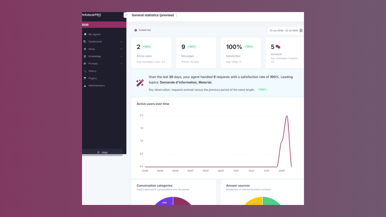
Everything on this dashboard is computed from real usage telemetry over the period you select with the date range picker. Nothing is estimated or invented: if your agent has no measurable usage yet, the dashboard shows honest empty states (for example, "No measurable usage yet") instead of placeholder figures. Sections fill in as real data arrives.
# Guided Tour
A Guided tour button sits next to the date range picker. It walks you through the dashboard step by step and explains what each section represents and how to read it. Steps whose section has no data yet are skipped automatically, so the tour always matches what you actually see.
# KPI Tiles and Period Summary
The top of the dashboard shows key indicators for the selected period:
- Active users: distinct users who interacted with the agent
- Messages: total user messages, plus the average number of messages per user
- Satisfaction and average rating: computed from the feedback users left
- Knowledge base content counters (Documents and FAQ)
Below the tiles, a narrative period summary card gives you a one-sentence readout: how many requests the agent handled, the satisfaction rate, and the leading topics, together with a key observation comparing the period with the previous one of the same length.
# Active Users Over Time
A trend chart plots active users per day across the selected period, so you can see whether adoption is growing, stable, or dropping after a launch or a communication campaign.
# Channel Distribution and Answer Sources
Two donut charts break the activity down:
- Channel distribution: where conversations take place (Microsoft Teams vs. Webchat)
- Answer sources: which references the agent cited in its answers (FAQ, documents, web search)
# Most Active Users
The Most active users list ranks users by number of messages sent over the period. Anonymous Webchat users are included and grouped as Anonymous users.
# Conversation Categories and Top Keywords
The Conversation categories donut shows the topics the AI detected in conversations over the period. The Top keywords card renders the most frequent terms as a frequency-scaled word cloud, so recurring vocabulary stands out at a glance.
# Most Asked Subjects
The Most asked subjects list groups user questions into subjects using AI classification (the same conversation categories shown in the donut). Each subject is clickable. The drill-down shows:
- Analysis: the subject's rank, request volume, and share of all detected intents
- Associated questions: the real, verbatim questions users asked on this subject (deduplicated)
- Expert tip: editorial advice on how to answer this kind of subject well
- Action to take: a recommended knowledge base action, such as creating or updating a FAQ or document
- Communication plan: suggested channels to activate for this subject, such as a push via Company Communicator Pro, the onboarding guide, an internal newsletter, an in-app banner, or a scheduled Teams message
- Associated references (estimate): the FAQs and documents the agent cited when answering this subject, so you can check that each source is present and up to date
# Knowledge Base Activation
Two ranked lists show which of your content actually gets used:
- Knowledge base documents: documents ranked by how often they were cited in answers
- Knowledge base questions: FAQs ranked by how often they were cited in answers
Configured items that have never been cited stay visible with a count of 0, which makes unused content easy to spot.
# Ratings and Recommended Action Plans
The Ratings by score chart shows the distribution of the ratings users left. Finally, the Recommended action plans section lists adoption best practices (re-engagement, content gaps, answer quality, champions) with impact and effort labels and concrete steps. These plans are qualitative guidance to act on what the data above reveals; they do not contain invented figures.
# Key Takeaways
- All metrics are calculated on the selected time period
- Users are counted uniquely
- The satisfaction rate reflects a real balance between positive, neutral, and negative feedback
- Topic and keyword analysis is fully automated by generative AI
- The General statistics (preview) tab adds adoption analytics built exclusively on real usage telemetry, with a guided tour and per-subject drill-downs
# Conclusion
The AI desk Pro Dashboard is a powerful tool for monitoring the performance and user engagement of your AI desk Pro instance. Use the insights gained here to make informed decisions to enhance your service.
Remember, the dashboard is an overview tool. For detailed analytics and user behavior, review the conversation history.